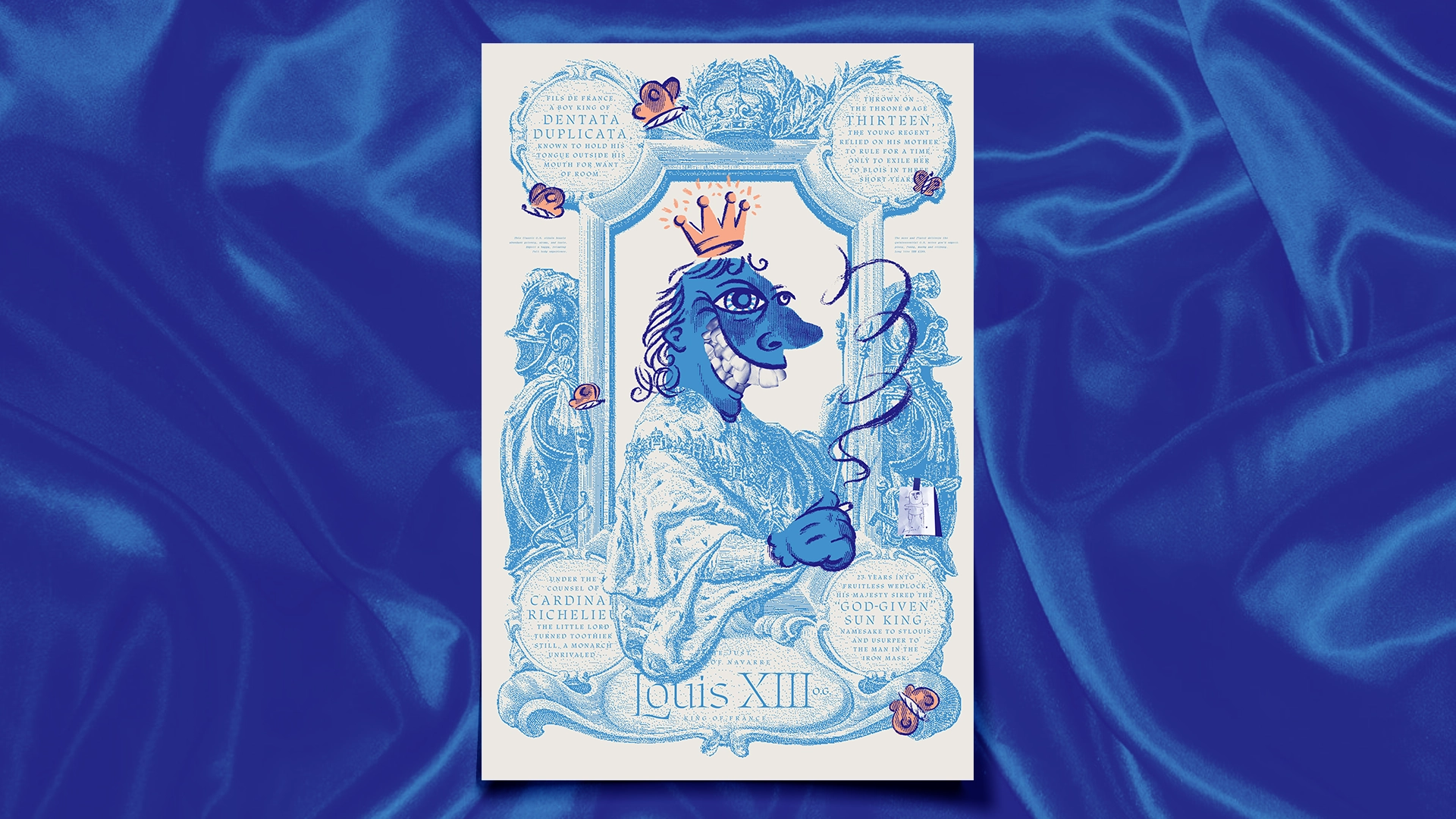
For the second annual Wallflowers Poster Project — a bud-themed gallery show benefiting the National Alliance for Mental Illness and the Last Prisoner Project — I was given the delightful task of creating a poster for indica strain, King Louis XIII. Check out the high-res here 👀.
This project kicked off an intense binge into French royal history, a heady fog of Richelieu, the Huguenots, and the Habsburgs. Here’s a fun fact for you: King Louis XIII had two sets of teeth. Yes, two. And just like his dental records, his majesty was complex. Often ridiculed for his speech impediment and sexually repressed, he had no problem pushing the limits of his powers to their moral limits, like the time he exiled his own mother. He likely would himself have benefitted from a joint now and then.
Conceptually, I knew early on that a royal portrait would lend plenty of opportunities to imbed numerous historical curiosities and have some fun with the mashup of regal pomp and stoner grotesqueries. Naturally, I used photos of my own teeth to collage together the monarch’s famous dents, which then became my go-to creepy interjection at the gallery. “Recognize anything about those chompers, friend?” I whispered into the ears of passersby.

I went deep on period-accurate French typography. Ultimately picking OTF’s Etude for its gravitas and nib-pen details. The stencil-like breaks evoke a sense of stone carving softened by time. The supporting copy is set in Brureau Brut’s Droulers, simply because I liked the contrast of the italic, mono-spaced, staccato rhythm. To me, it feels like a good drummer, knowing how to drag the beat, just a hair, to help everything feel a little looser.

Hidden throughout are Easter eggs and obscure references. But the best, in my view, is Louis’s self-portrait from childhood — an adorable and endearing relic from a guy clearing struggling with body issues.
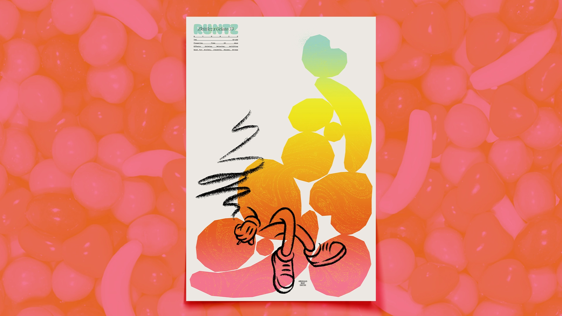
I tried to keep this in the same stylistic family as my poster for the previous Wallflowers show. A mix of scratchy pencils and vector shapes, candy colors and cartoon gloves brings a bit of continuity to the pair. Hey, collect ’em all! If you missed the show, you can still shop or donate here.


